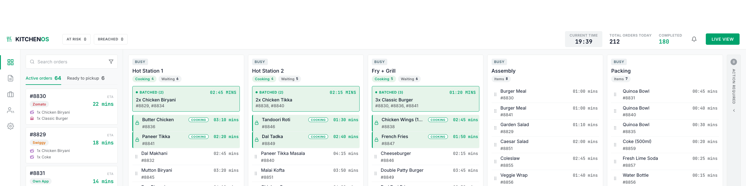
where every order goes out on time, even at peak rush.
Two findings from mapping the order manager's rush. I sorted his work into two piles. The parts a computer can do, and the parts that need him. Then I walked one order through the screen, step by step, and let that decide what stays visible and what collapses. Plus the part where AI gave me bad designs three times before I worked out the problem was me.
A cloud kitchen has no tables. It only cooks for delivery apps.
This one runs three brands. Biryani. Healthy bowls. Burgers.
Rajeev is the order manager. Every order goes through him. He decides what gets cooked first and who is cooking it. He knows this kitchen well. How fast each cook works and what each cooking station can take.

More than 80 orders come in from Swiggy, Zomato and the kitchen's own app. And chaos ensues.
Some orders get delayed while some cooked orders keep getting colder waiting for their delivery rider.
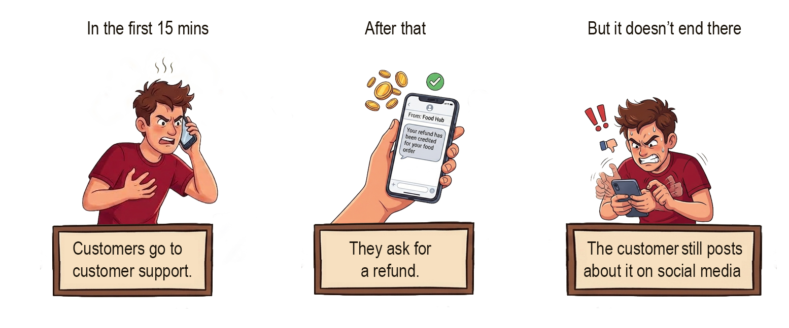
The brand takes the damage.
One desktop screen for the kitchen. Rajeev is the main user.
But before I could design it, I had to find out what was actually going wrong.
I went in thinking this was a speed problem. More orders, less time, so make the kitchen cook faster.
To confirm my assumption, I wanted to stand where Rajeev stands. So I mapped his current process, step by step.
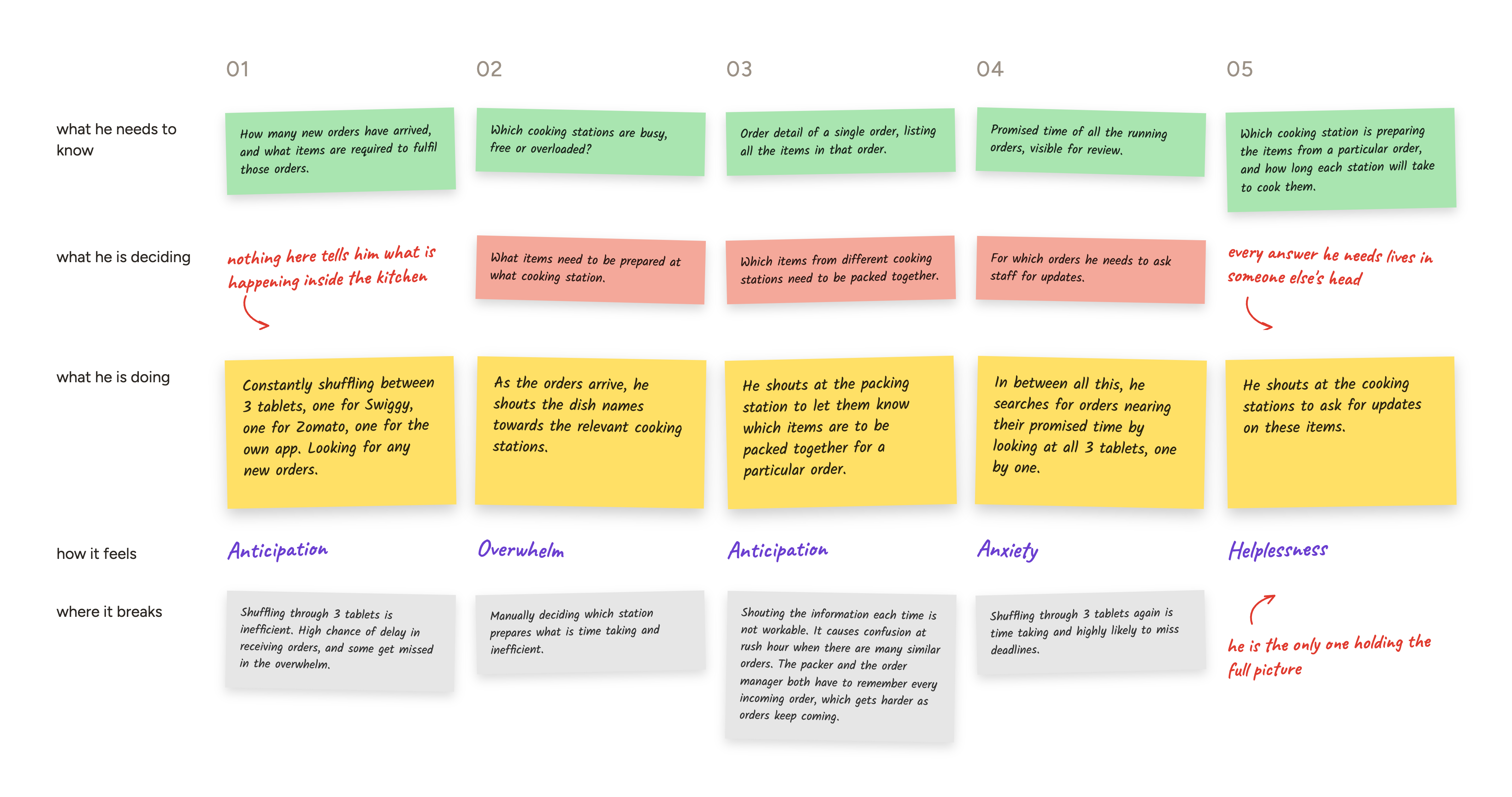
Nothing in the map showed a kitchen that was too slow. Cooking times were already tight. The stations could handle the load.
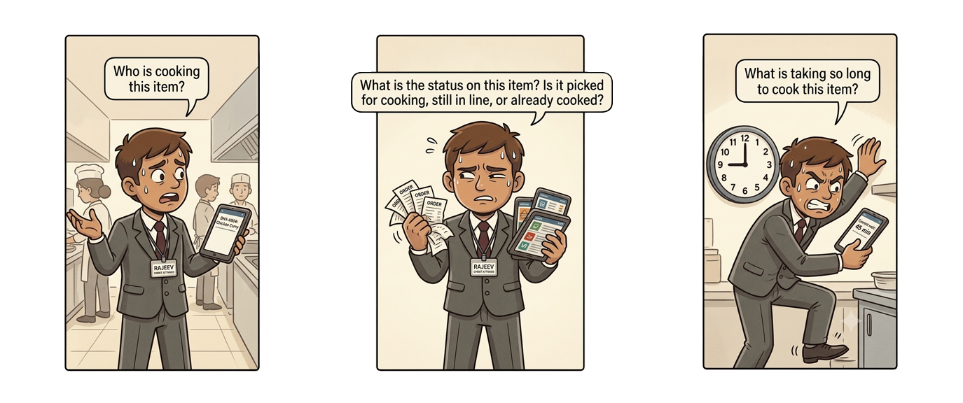
But what grabbed my attention was a panicked Rajeev, in the middle of a rush, shuffling between three tablets. Trying his best to accept new orders, scanning for orders which are about to get delayed, shouting across the room to ask for cooking status of random items.
He knows how to do his job. Yet he is standing there, clueless, hunting for information.
That's when it hit me.
Rajeev was never short on speed. He was short on visibility.
Making one decision needed him to check two or three places. Sometimes it needed him to ask someone and wait for an answer.
That was the bottleneck.
This one came from reading the map back.
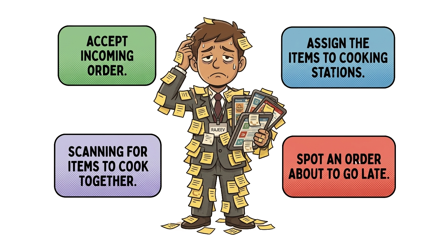
Rajeev was doing all of it by hand. At 80 orders an hour. From memory.
A computer can do this faster than a person. And it also does not get tired at order sixty.
His time and mental energy were going into work a system could do.
The journey map gave me everything Rajeev handles in a rush. I went through it and asked one question about each item.
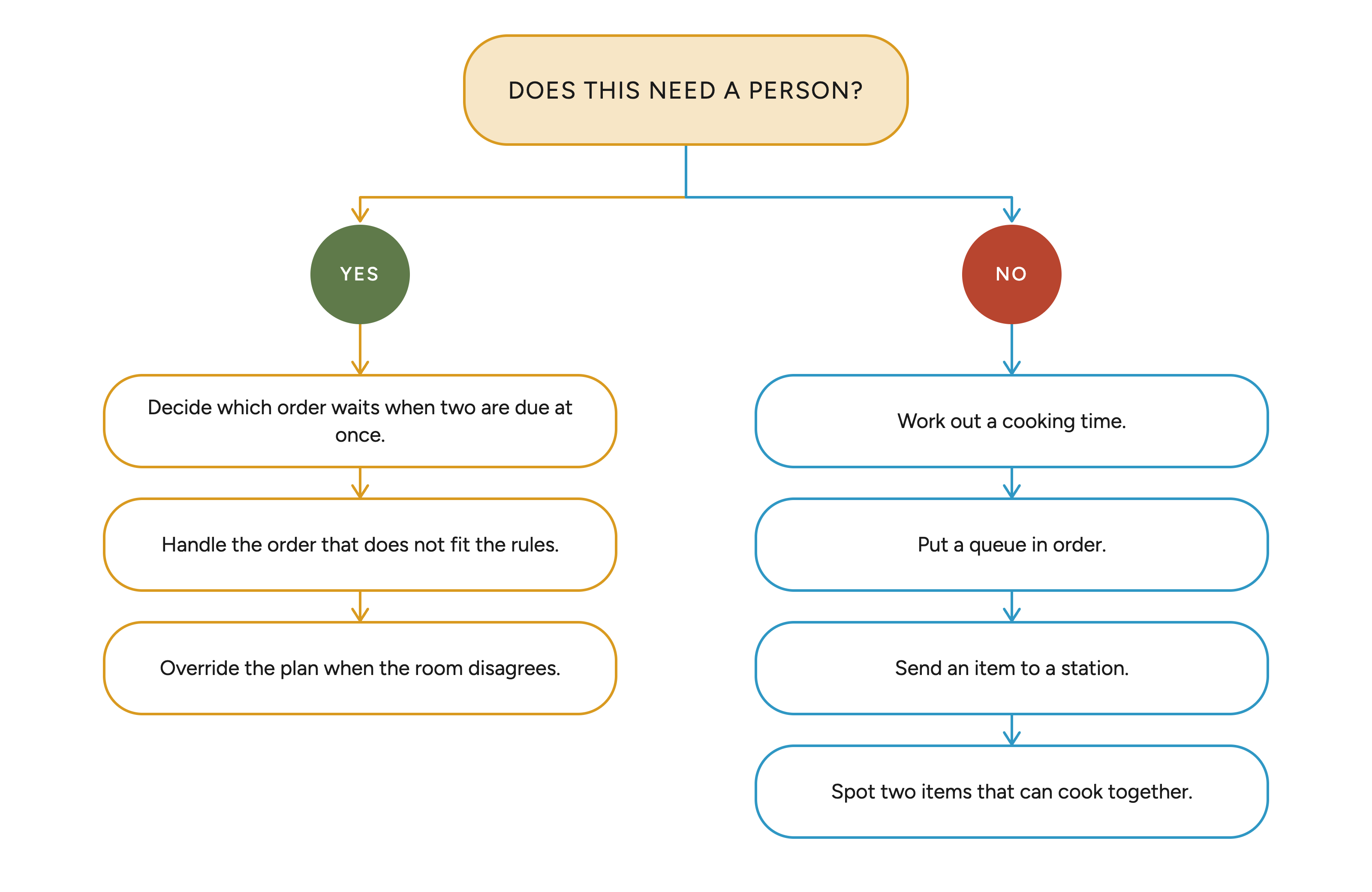
Making sure no order goes late is Rajeev's main job.
But a system spots a coming delay earlier than he can.
So I split it.
The system detects potential delays and suggests a fix. But Rajeev makes the final call.
So I designed four features.
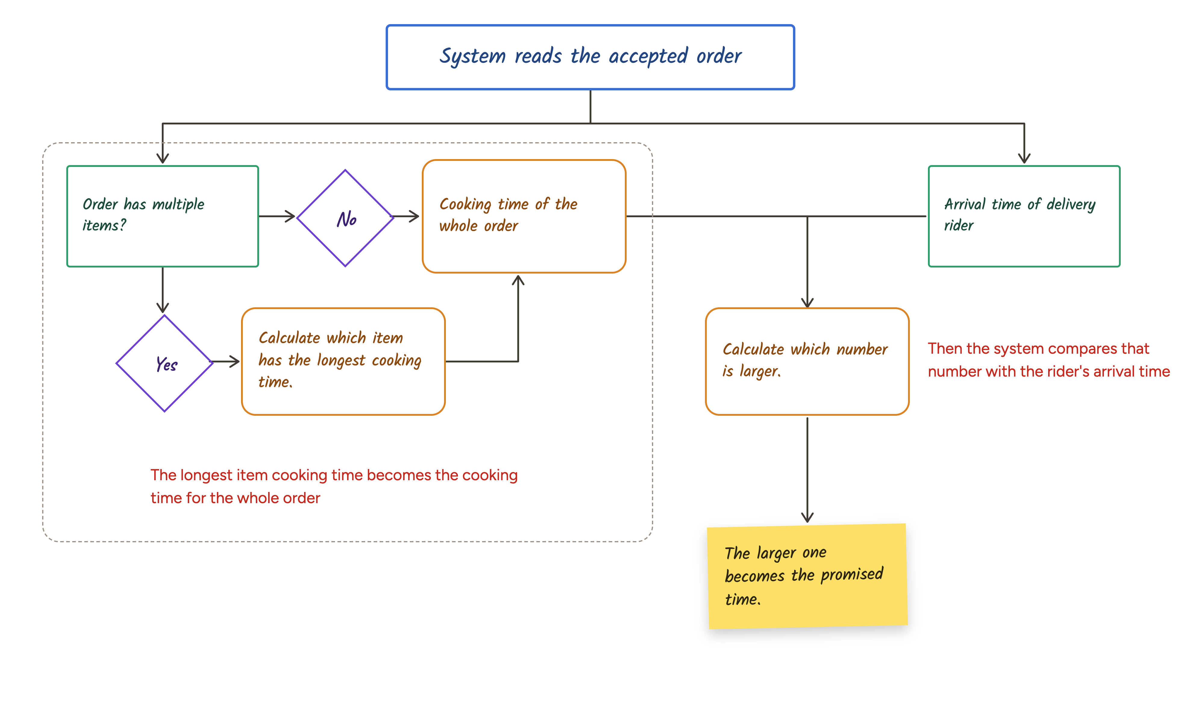
The system reads an order and works out its ETA.
The longest item cooking time becomes the cooking time for the whole order.
Then the system compares that number with the rider's arrival time. The larger one becomes the promised time.
Every item goes into its station queue on its own.
The queue is ordered by ETA. Earliest sits at the top.
Rajeev stops sending items to stations. He supervises a queue that is already correct.
Items that can be cooked together get grouped together.
The system only does this when their promised times are close.
It works across brands. A biryani for one order and a biryani for another can go in the same batch.
Nobody spots this by hand across 80 live orders. The system does it every time.
The system watches every order for a delay before it happens. When it finds one, it raises an alert and suggests a fix.
It does not apply the fix. Rajeev decides.
A kitchen has too much a system cannot see. A cook is off today. A station is running hot. A rider is unreliable and Rajeev knows it.
Items, cooking times, station, batch, promised time, rider, platform, customer, order history.
All of it on screen is the same chaos, rearranged.
The first map showed me a process. This time I wanted to see the experience.
So I imagined one order running on the dashboard I had designed, and mapped it the way it should go.
From the moment it arrives to the moment it leaves. What is Rajeev doing right now? Where are his eyes? What does he need to know at this exact moment?
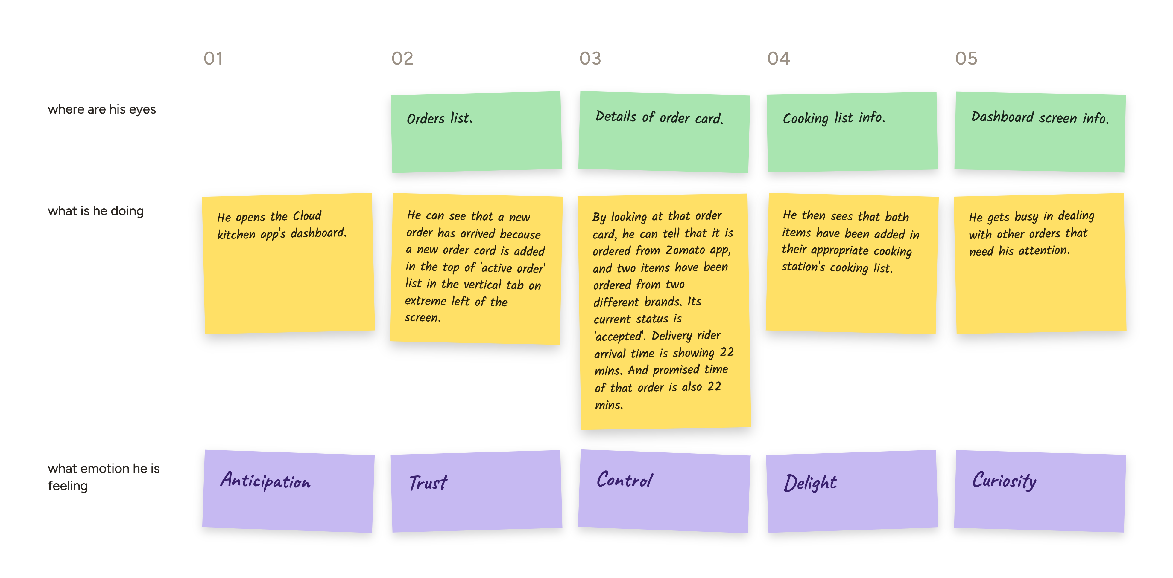
That gave me the clarity I needed.
| Why it stays | |
|---|---|
| Station status and load | He cannot route work without it |
| At risk and breached counts | The two numbers the business counts |
| Order number | He traces items back to orders constantly |
| Which app it came from | Whose promise he is keeping |
| Order status | Where the whole order stands, before he opens anything |
| Promised time | The one number the whole job is judged on |
| Items, marked by brand | What has to be cooked, and which kitchens are in it |
One click away on the expanded card.
| On the expanded card | When he needs it |
|---|---|
| Which station each item went to | Checking the routing held |
| Cook time left on each item | Judging whether the order makes its promise |
| How far each item has got | Chasing one slow item |
| Rider ETA and journey progress | Food is ready early and would sit |
| Full brand name per item | Only when the brand mark is not enough |
And the rest is surfaced by the system, never hunted for.
| Surfaced by the system | When it appears |
|---|---|
| Batch grouping and the orders it feeds | When the system finds a match |
| The delay alert, its plan and projected finish | When an order is going to breach |
This flow shows how Rajeev handles a delay alert.
It opens on a clean board. Sixty-four orders live, nothing at risk.
A new order lands. The system reads it, works out its ETA, and drops each item into the right station queue. Rajeev does nothing.
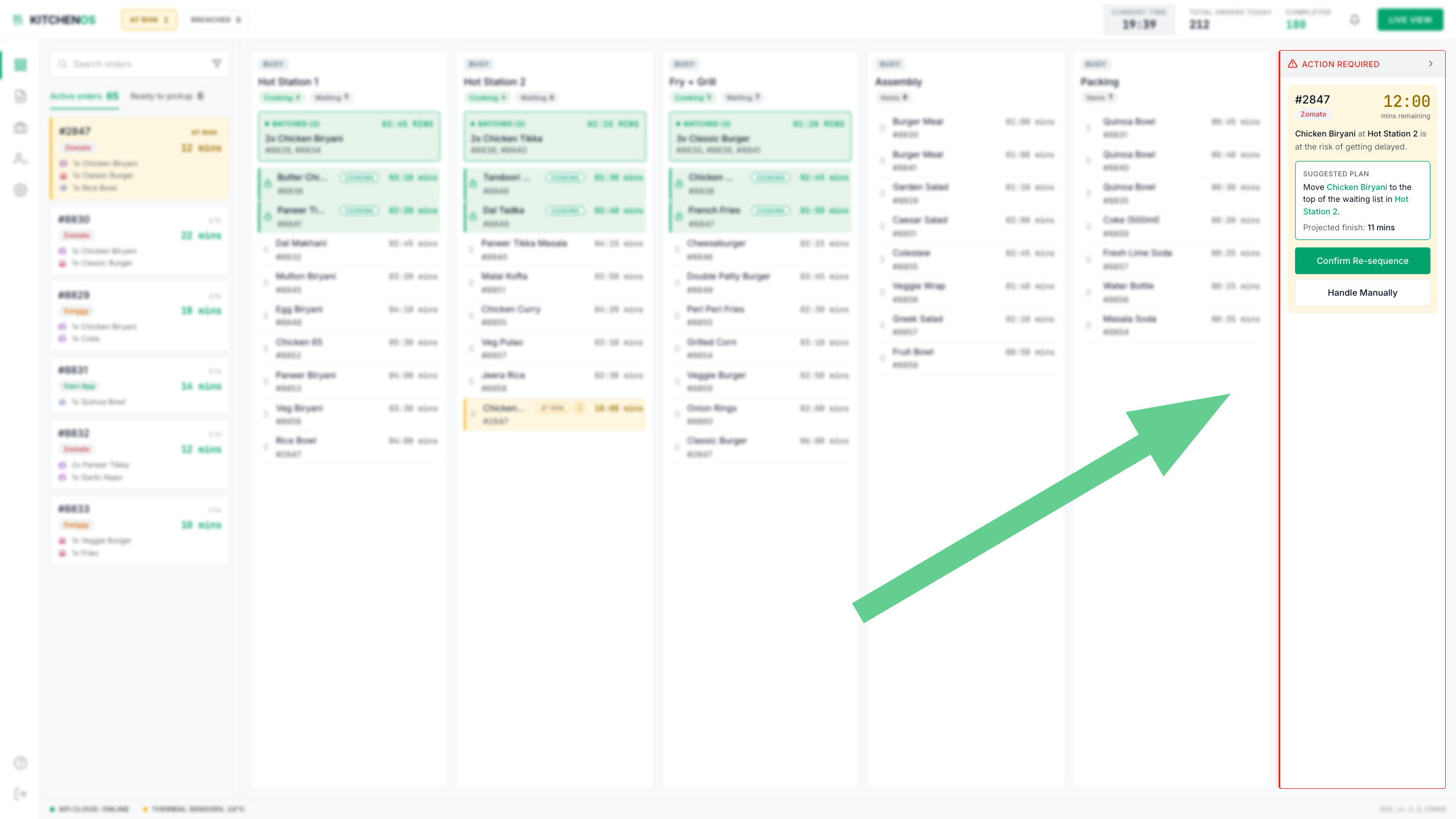
Then one item starts to slip. Chicken Biryani at Hot Station 2 is not going to make its promised time. The alert arrives in the panel and waits.
He opens it when he is ready. The problem is stated, a fix is proposed, and the projected finish is there so he can see what the fix buys.
He takes it. The queue re-sequences, the order comes back inside its promise, and the board goes quiet.
Data heavy but not crammed.
This screen holds 80 live orders. Colour has to mean something otherwise it will be too hard to focus on anything on it.
So I went looking for references. I found two or three that came close.
I gave those references to Claude. What came back was generic. Hard outlines on everything. Dull colour. A dashboard, but not my dashboard.
I tried Figma Make. Same result.
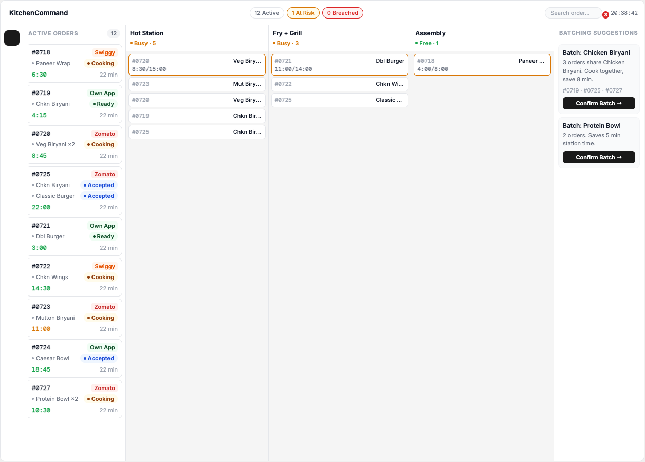
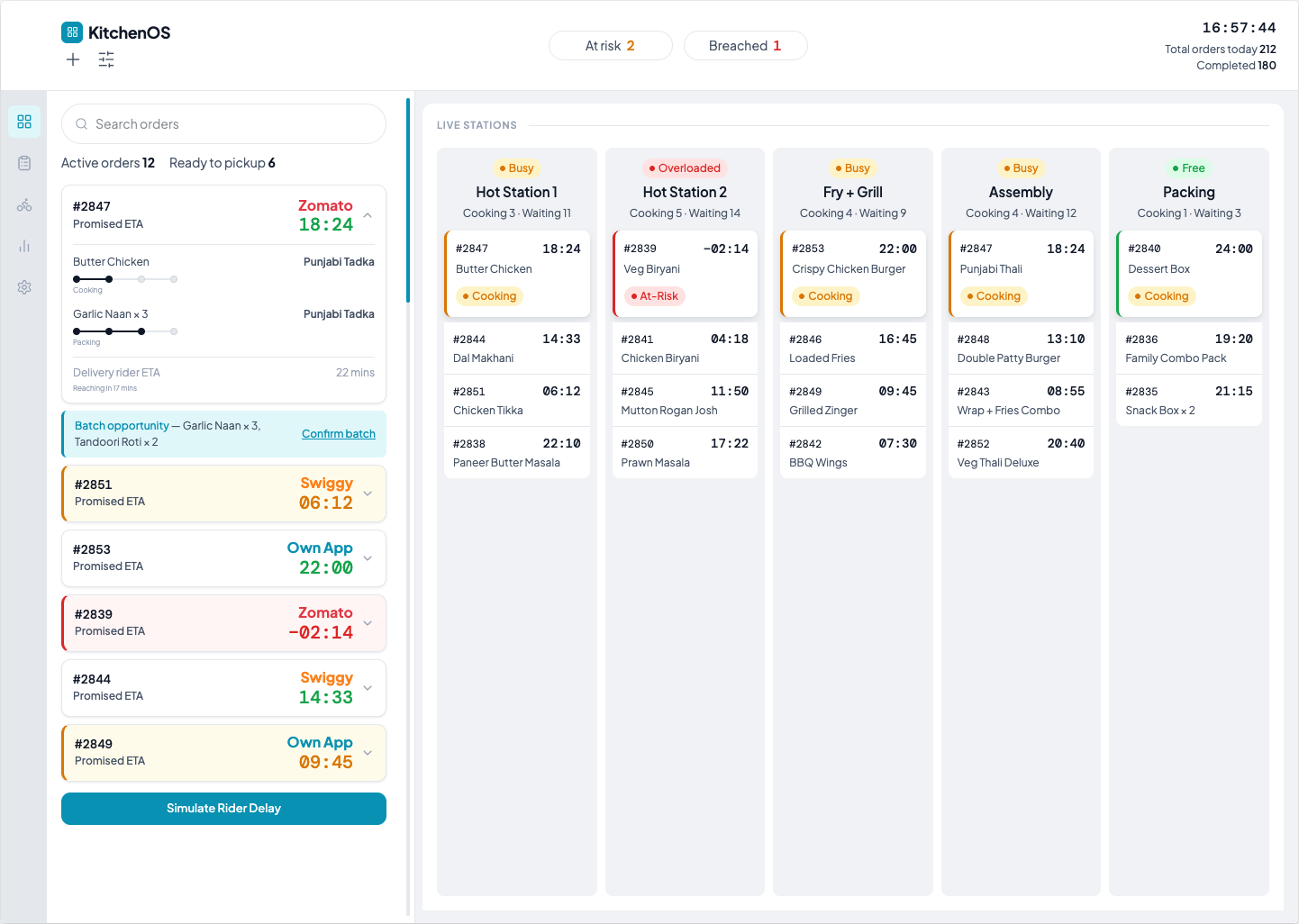
I was two tools in and about to try a third.
Then I realised that I had made two mistakes at once.
I never showed it a layout. I described what I wanted and expected it to work out the structure. It cannot guess a layout. So it reaches for the most common one.
I gave it three references. Three directions do not sharpen an instruction. They get averaged. And the average of three looks like nothing in particular.
I went back to Figma. I drew the wireframe by hand.
Every panel. Every region. The whole structure I had already settled during the system work.
No styling. Just the layout.
Then I picked one reference and dropped the rest. A settings dashboard from Vantus ERP.
I do not know if it is a real product. It was data heavy and still completely legible. The way it used white space and grey tones was exactly how I envisioned my dashboard should look.
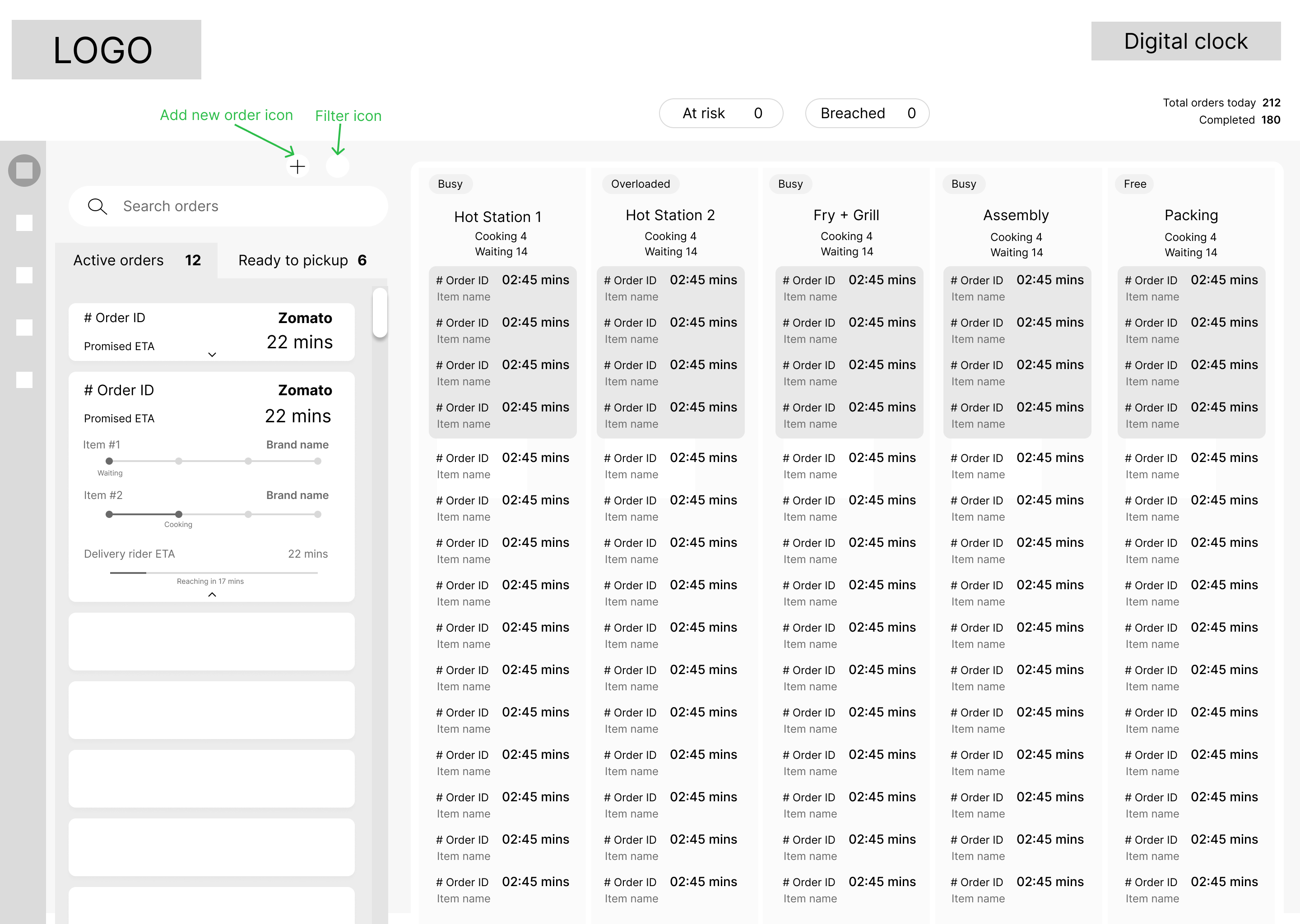
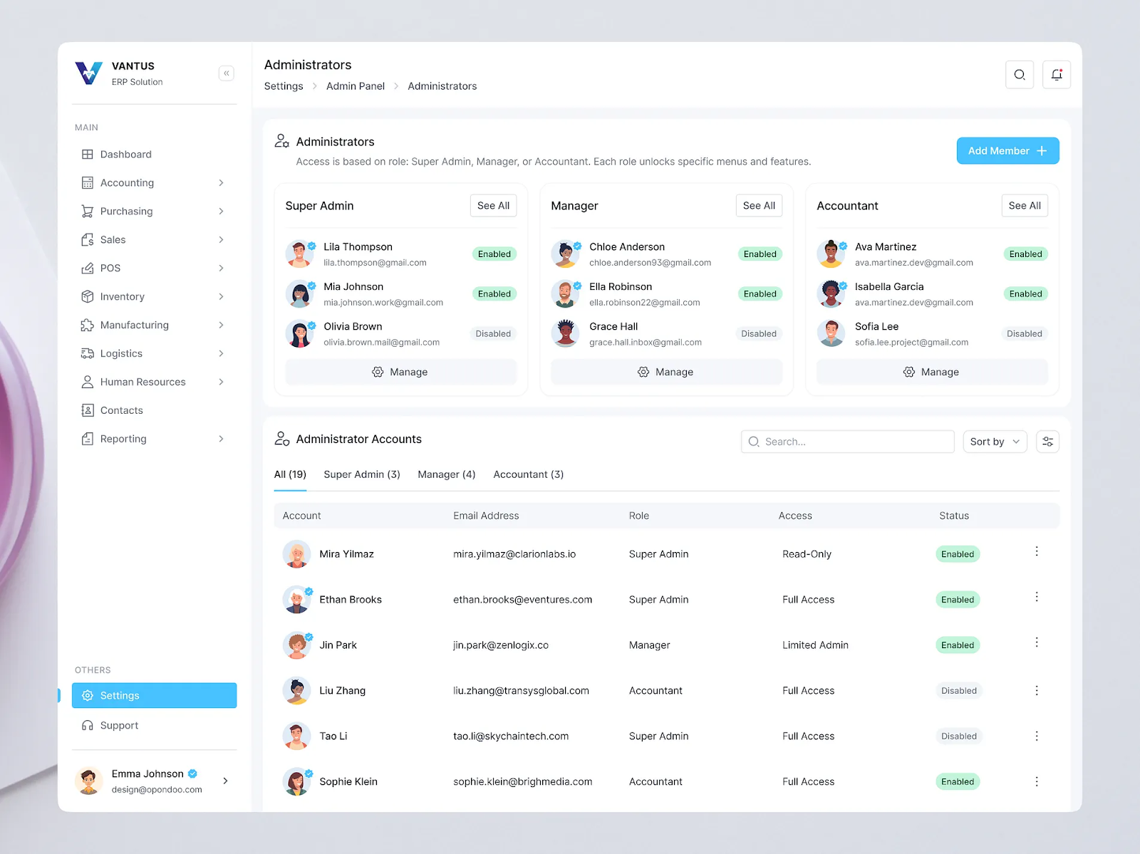
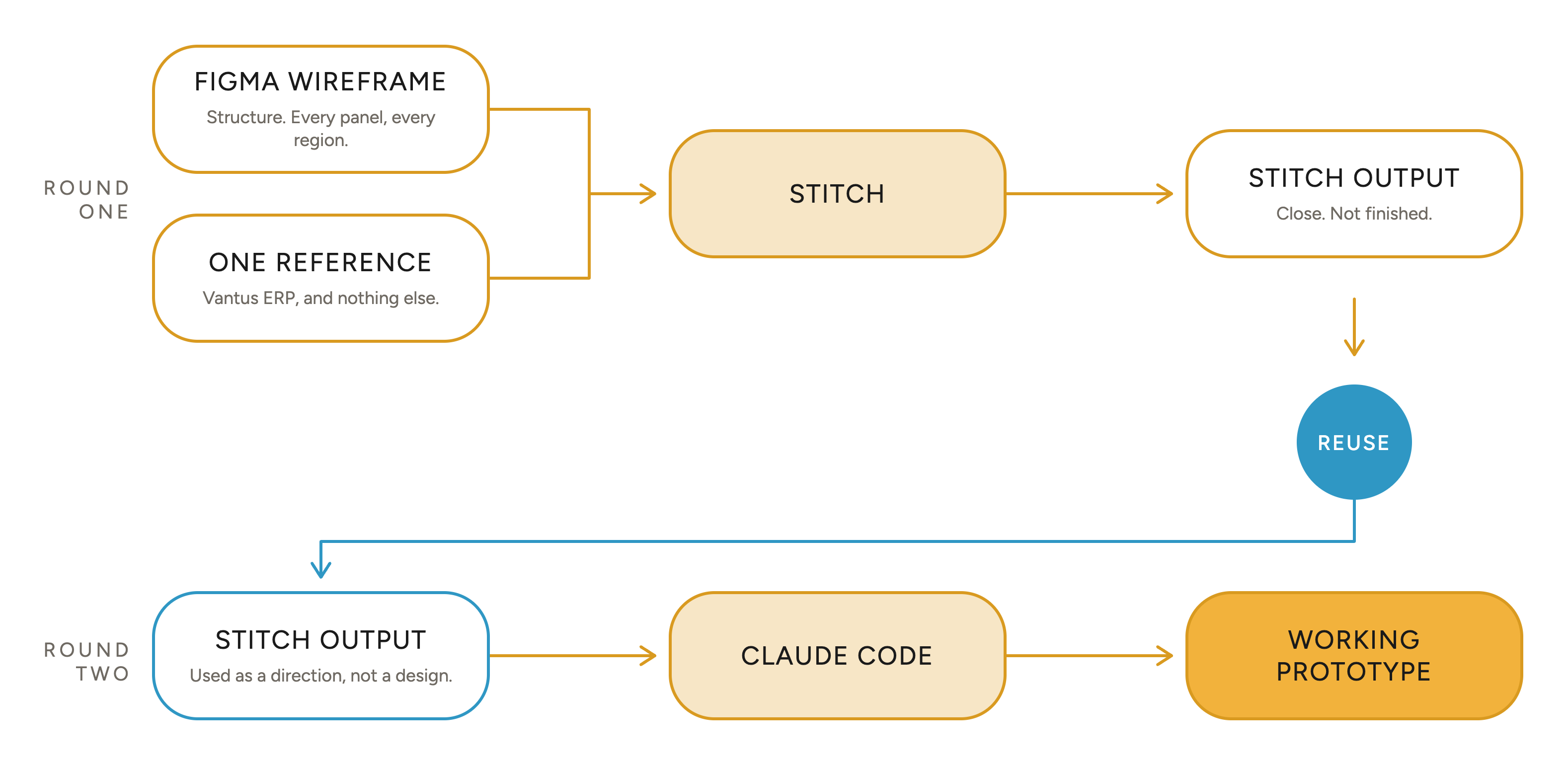
I gave both to Stitch. Structure from my wireframe. Visual direction from the one reference.
This time the output was close to what I had in my head. Not finished. Close enough to use.
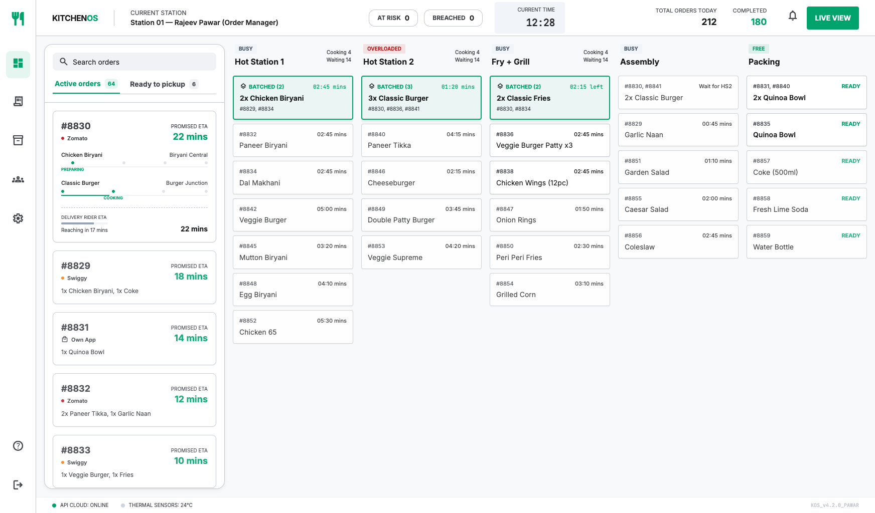
I did not treat the Stitch output as a design. I treated it as a direction.
I gave it to Claude Code and it built the prototype against that.
Then came the longest stretch of the project. I prompted Claude Code through change after change.
The order card went through several rounds.
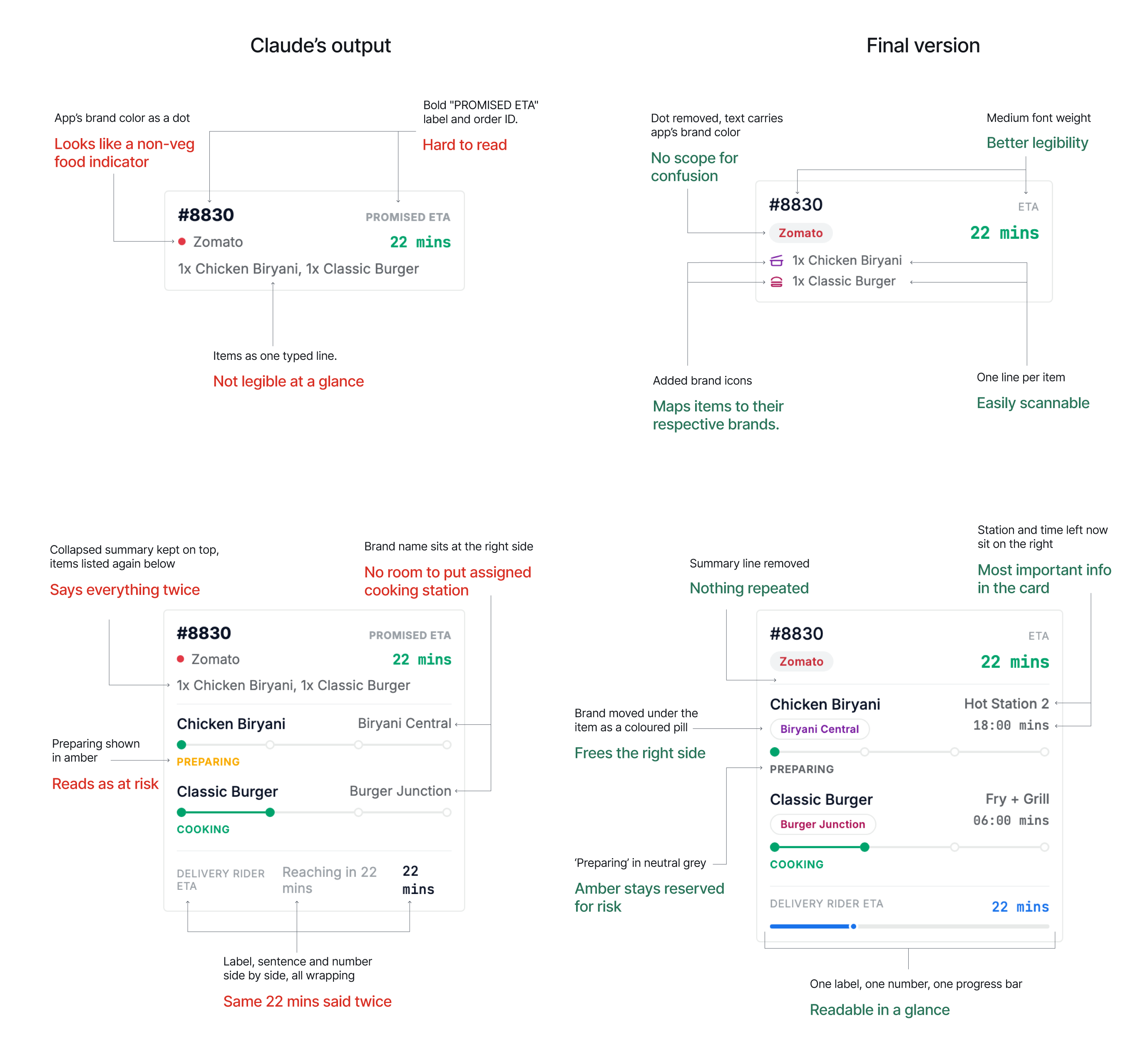
I stopped when I believed the UI would hold up in real use. Not just in a screenshot.
I had built the delay alert as a modal. A delay is urgent, so I blocked the screen until Rajeev responded to it.
Anudeep, my mentor at UX Gym, found the problem. Rajeev is always in the middle of something. A modal gives him no way to finish it.
He has to stop everything, right now, for every alert. Even when that alert is not the most urgent thing on his screen.
He was right.
I had designed for the urgency of the alert. Not for the person receiving it.
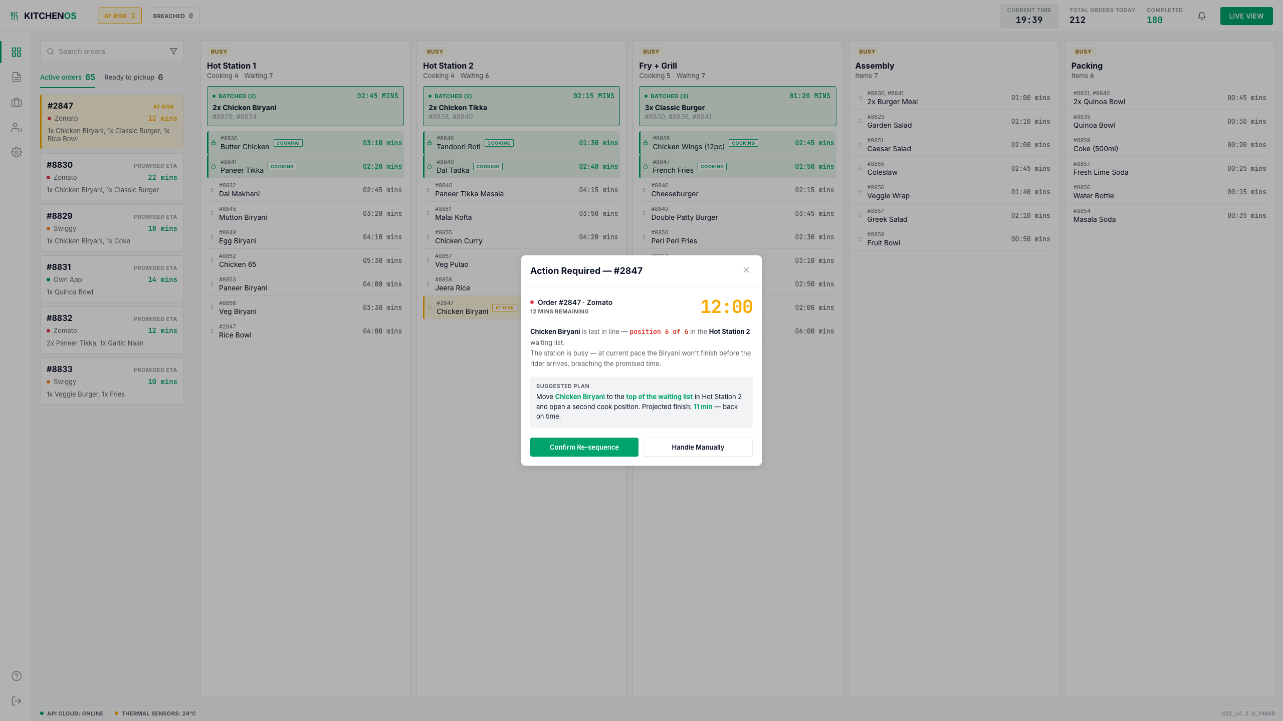
Alerts moved to a notification panel on the right of the screen. The alert arrives and waits. Rajeev opens it when he chooses to.
This never ran in a real kitchen. So I have no performance numbers.
What I can show is different.
Every decision in here points at something the business already measures.
I kept this map from the moment I started deciding things.
| What I built | What it fixes | Business impact |
|---|---|---|
| One screen for every order, across all brands and apps | Orders sit on three tablets and nowhere together | Delayed ordersFewer refunds and public complaints |
| Live cooking status for every item | Cooking status exists on no screen, so he has to ask | Delayed orders · Handover timeLess time lost asking, more orders out |
| Promised time on every card, urgency hierarchy | He cannot tell which order is close to going late | Delayed ordersProblems caught while they can still be fixed |
| Auto slotting and auto routing | Reactive sequencing overloads stations | Handover timeThe same team clears more orders per rush |
| Auto batching surfaced by the system | Nobody spots batches by hand at 80 orders an hour | Handover timeCooking time saved on every matched pair |
| Live station load, always visible | He cannot see station load at a glance | Handover timeNo station idle while another is buried |
| Delay alert with confirm or handle manually | He finds out an order is late only when it is already late | Delayed ordersA breach avoided instead of explained |
Automating the rule work was never only about speed. It was about giving Rajeev his attention back.
He can spend it on the problems that actually need a person.
There is no number for that.
Nobody measures how well someone uses the focus they got back.
I still think it is the most valuable thing here.
What the product does had to be right first. Only then could what it looks like mean anything.
Why is this collapsed. Why is this red. Why is this loud. The answer was always sitting in the behaviour.
So I was never choosing by taste alone.
I built a working dashboard without writing a line of it.
I directed the whole way. Every decision about what it does and how it behaves stayed mine.
What surprised me was how much of the work stayed with me. The thinking did not get easier.
I thought anything I made with AI would feel less like mine. I thought I could not show it to anyone as proof of what I can do.
That was wrong.
It is not about whether you use AI. It is about which parts you hand over.
I never asked it for a solution.
I used it where the work was slow and mechanical. Pulling research together into something I could read in one pass. Turning a design I had already decided on into a running prototype.
The decisions stayed with me the whole way.
I would talk to people much earlier.
Anudeep found a real problem in a design I thought was finished. Every day I waited before showing it was a day I spent refining something I would have to change.
The moat is knowing how a product should behave.
AI is a good tool and it will move fast for you. Just make sure it is moving towards something you decided.